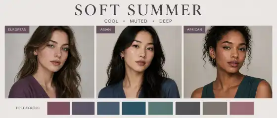
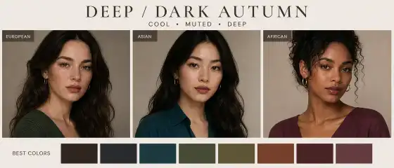
If you feel that some colors make your face look softer and fresher while others are too harsh, this article on Soft Autumn will help you understand which shades support the natural harmony of your appearance.
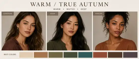
Soft Autumn: what this color type looks like and how it is beneficial
If you feel that some colors make your face look softer and fresher, while others are too harsh, bright, or "loud," the article about Soft Autumn may be very helpful. This color type helps to understand which shades support the natural harmony of appearance: they don't clash with it, don't overload it, but rather gently highlight the features.
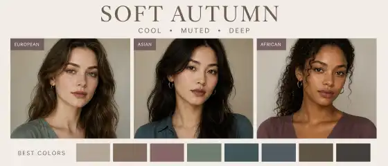
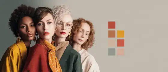
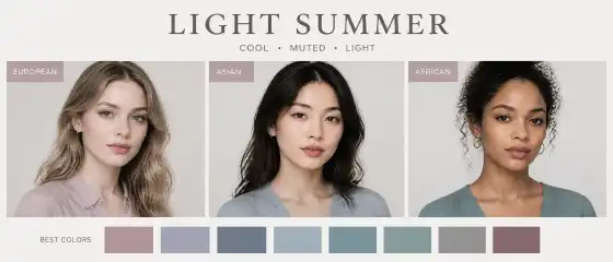
Soft Autumn is often liked by those who love a calm, cozy, "effortlessly expensive" palette. It features warm, muted, not too contrasting colors. This type of appearance can be found in people with different skin tones, hair, and eyes — from fair to deep skin, from dark hair to softer brunette shades, from brown eyes to green, hazel, and mixed.
Brief portrait of the color type
Temperature: warm, but not "hot" and not golden-bright; soft warm shades work best.
Contrast: low or medium-low. Transitions in appearance are usually soft.
Depth: medium, sometimes slightly muted. Colors should not be too transparent or too heavy.
Saturation: low. Complex, dusty, "smoothed" tones are suitable.
Overall impression: softness, warmth, naturalness, calmness, delicacy.
Soft Autumn rarely looks striking due to sharp contrast. Its strength lies in harmony. In a successful palette, the face appears more even, the gaze calmer, and the image more expensive and cohesive.
Visual guide to the palette and style

How to understand if this is your color type
You can recognize Soft Autumn by how the appearance reacts to different colors. Usually, in a soft warm palette, a person looks more lively, and the face more composed and fresh. In too bright, cold, or contrasting shades, features may become harsher, and the skin visually more tired.
Muted warm colors suit you better than bright pure tones.
Too cold snow-white, neon, or very black items can make the face look stricter.
You often like shades with "dust," softness, haze: they look harmonious and calm.
Looks without strong color jumps and sharp contrasts work best.
The skin can be light, medium, tan, or dark — the important thing is not the skin tone itself, but its combination with soft temperature, depth, and low contrast.
Hair and eyes can also vary: from dark chestnut to blonde, from green to brown and hazel.
A useful guide: if colors like dry leaves, soft suede, warm sand, sage, cocoa with milk suit you, then the likelihood of being Soft Autumn is quite high.
Best colors
The Soft Autumn palette is built around warm, muted, soft, and slightly complex shades. These are not "pure" colors from a paint box, but more calm options with a hint of gray, brown, or olive.
Base colors
Light shades
cream
oatmeal
sandy
light caramel
soft apricot
warm light olive
Dark shades
Accent colors
Neutral colors
A good formula for Soft Autumn: warmth + softness + a bit of depth. If the color is too bright, it often clashes with the appearance. If it's too cold, it can "distance" the face and make it less lively.
Colors to be cautious with
This color type usually doesn't have unsuccessful colors in an absolute sense, but some shades may be less flattering near the face. They can be used in bags, shoes, prints, or lower layers if you like them.
Pure black: can be too harsh and create excessive contrast.
Ice white: often looks too dry and cold.
Bright blue, electric pink, neon shades: often draw attention to themselves.
Cold pure pastels: can make the look paler and less cohesive.
Very cold grays and steel shades: sometimes "mute" the warmth of the appearance.
Highly saturated jewel tones like bright emerald or ultraviolet: if they are too pure, they may lack softness.
If you like a complex shade but it seems too active, try wearing it further from the face — in pants, a skirt, shoes, or a bag. This way, the look retains character but doesn't clash with the natural softness of the appearance.
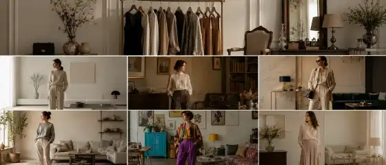
Clothing and style
Soft Autumn is especially well-expressed in styles where naturalness, soft lines, and the absence of sharp graphics are important. It usually suits looks that appear calm, composed, and slightly relaxed.
Suitable directions
Casual: soft sweaters, straight jeans in warm blue or gray-blue shades, suede sneakers, cardigans.
Smart casual: beige pants, sage-colored shirt, soft taupe jacket, leather loafers.
Natural: linen, cotton, suede, matte textures, loose silhouettes without rigid geometry.
Romantic in a soft version: drapery, flowing lines, delicate floral prints in a muted palette.
Elegant: calm monochrome looks in caramel, chocolate, and olive shades.
Urban: soft coat, basic knitwear, straight pants, shoes without excessive shine.
Sporty chic: comfortable silhouettes in dusty warm colors, without overly contrasting stripes and acidic details.
Examples of successful looks
cream top + olive pants + warm beige jacket;
dusty terracotta dress + suede sandals or ankle boots;
sage sweater + jeans in a warm blue shade + caramel bag;
brown midi skirt + soft oatmeal-colored top + matte metal jewelry;
monochrome in taupe shades: top, bottom, and shoes in the same color family.
Fabrics with a soft texture look best: suede, matte leather, knitwear, tweed without sharp contrast, linen with noble unevenness, soft cotton. Too shiny and rigid materials can "consume" the natural softness of the look.
Makeup
Makeup for Soft Autumn works best when it doesn't clash with the natural warmth and softness of the face. Here, the principle is especially good: better a bit softer than too bright.
Tone
foundation with a warm or neutral-warm undertone;
natural or satin finish instead of a dense "mask";
too pink or too gray a tone may look alien.
Blush
Lips
Eyes
olive
bronze
warm taupe
soft brown
khaki
dusty green
delicate copper accent
Often, it's better to avoid effects like too cool gray smoky eyes, harsh black graphics, and very contrasting eyeliner if they make the face appear sharper. Instead, you can opt for blending in chocolate, bronze, or olive tones.
Hair color
Soft Autumn usually looks harmonious with soft, warm, and not too contrasting coloring options. The goal is not to create a sharp color 'hit' near the face, but to support its natural warmth.
warm light brown
golden chestnut without excessive brightness
caramel and honey highlights
soft chocolate
warm bronze shade
natural dark blonde and brunette tones
highlighting in dusty golden or caramel nuances
Too cool ash blonde, harsh coal black, or highly contrasting strands can sometimes clash with the softness of the appearance. If you want to experiment, it's better to choose complex, multi-layered shades without excessive coolness and without a 'graphic' effect near the face.
Jewelry and accessories
Accessories for Soft Autumn are best chosen with the same logic: softness, warmth, mutedness. They can be noticeable but should not be too shiny or flashy.
Metals: soft-toned gold, aged gold, bronze, copper, matte rose gold.
Glasses: frames in taupe, dark khaki, brown, tortoiseshell, soft olive.
Bags: caramel, chocolate, beige-brown, olive, warm gray.
Scarves: sage, terracotta, dusty coral, cream, sand.
Prints: small, blurred, natural; soft stripes, watercolor flowers, muted checks look better.
Textures: suede, matte leather, velvet with a light pile, dense knit, soft tweed.
Strong shine, chrome, icy gloss, and too strict graphics can look out of place. Accessories that seem to 'gather' the look and don't draw too much attention work much better.
Mini wardrobe capsule
An example of a simple everyday capsule in the Soft Autumn palette:
cream shirt or blouse;
sage-colored sweater;
taupe or warm beige pants;
jeans in a soft dark blue or gray-blue shade;
midi skirt in cocoa or olive-brown;
jacket in caramel or warm gray-beige color;
dress in muted terracotta or dusty coral;
oatmeal-colored cardigan;
shoes in brown or cognac tones;
bag in a soft beige-brown or olive shade.
From this base, it's easy to assemble both everyday and more put-together outfits: just change the shoes, jewelry, and accessories.
Common mistakes
Colors that are too bright near the face. They can overpower natural softness and make features appear harsher.
Pure black and snow white as a base. Sometimes they look too harsh, especially around the collar and face area.
Cool pastels. Icy pink or blue can make the look flat and 'wintery' to your disadvantage.
Excessive shine. Strong gloss, metallics, and very shiny fabrics can clash with the matte softness of the appearance.
Makeup that's too thin or 'transparent.' It can get lost and not support the complexion.
Sharp contrast between hair and eyebrows. Very dark, graphic solutions sometimes make soft features appear stricter.
Strong geometry in clothing. Rigid lines and sharp contrasts can look less harmonious than smooth silhouettes.
Short conclusion
Soft Autumn is not a set of strict prohibitions, but a convenient guide that helps you quickly find your best colors. This color type loves warmth, muted tones, soft depth, and calm harmony. When the palette matches your natural softness, the face looks fresher, the image more complete, and the clothes start to work for you, not against you.
If you recognize yourself in Soft Autumn, start small: add creamy, sage, caramel, and warm taupe to your wardrobe, observe your face's reaction in the mirror, and gradually build your personal palette. In color types, what's more important is not perfect theory, but how shades help you feel confident and natural.
FAQ
1) Can this color type be found in people with dark skin?
Yes, it can. A color type is determined not only by skin tone but also by the temperature, contrast, depth, and saturation of the appearance. A person with dark skin can also exhibit Soft Autumn as soft warmth, muted shades, and a lack of sharp contrast.
2) Can I wear black?
You can, if you like it. But for many Soft Autumn representatives, black near the face can be too harsh. It's often more successful to use it further from the face or replace it with dark chocolate, khaki, or very deep warm brown.
3) What if I like a color that is not in the palette?
Wear it in areas where it has less impact on the face: in a skirt, pants, shoes, bag, or print. Another good way is to soften the color with a neutral top, scarf, or makeup in a suitable palette.
4) How do I know if I have a warm or cool undertone?
Look at which shades make your face appear more even and fresh: warm or cool. It's helpful to try on creamy and pure white, gold and silver, peach and cool pink. If soft warm shades suit you more often, it may indicate a warm or neutral-warm undertone.
5) Can you change your color type with hair dye or a tan?
The external effect can be noticeably adjusted, but the color type itself does not change. Dyeing and tanning can make the appearance warmer, deeper, or more contrasting, but the natural features of the appearance will remain. Therefore, it's better to use such changes as a way to emphasize harmony, rather than an attempt to completely "redo" your type.